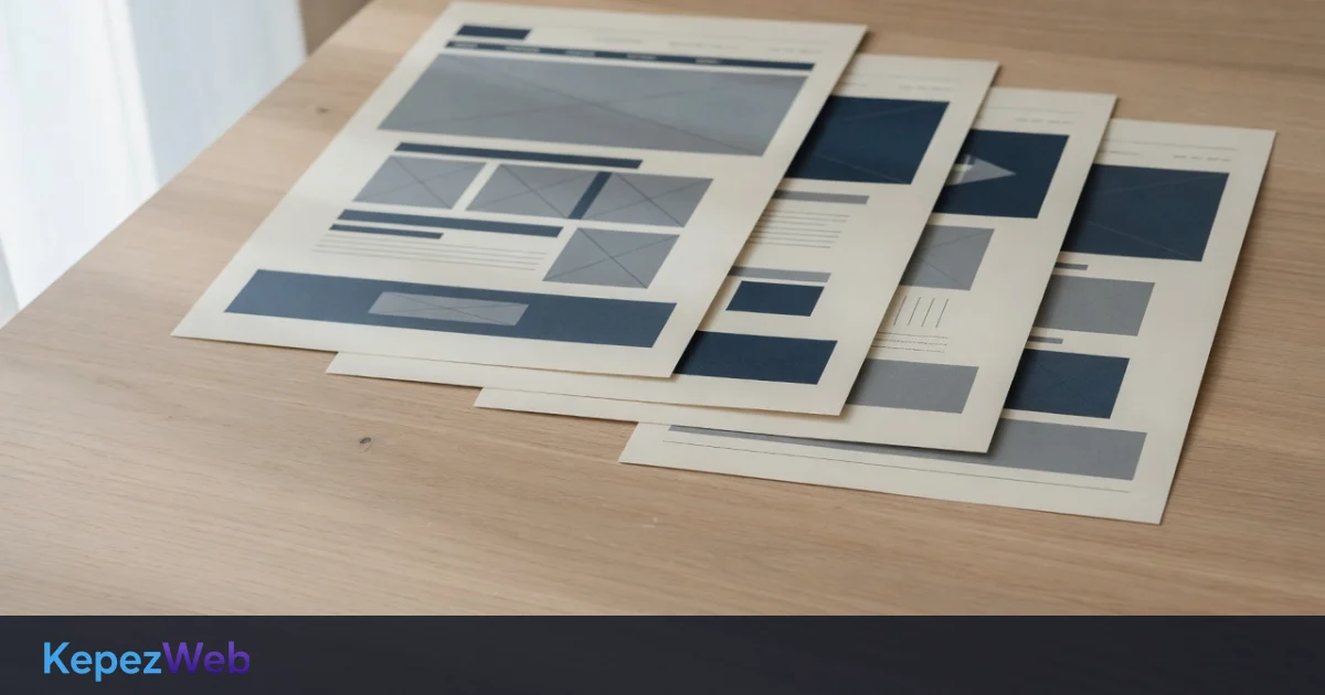
Landing page design matters when you pay for traffic. Explore eight practical rules covering headlines, forms, evidence, speed and mobile usability.
What Is Landing Page Design, and Why Does It Matter?
Landing page design shapes the first page a potential customer sees after clicking a Google Ads or Meta ad, or an email campaign. It is not your homepage: it is a dedicated entry page designed for a single goal and incoming external traffic. When spending on advertising, its design can make visitors’ decision-making and form completion easier.
Sending every visitor to the homepage can leave them unsure what to do next. A focused landing page presents one clear message and makes the intended action easy to understand.
1. Headline: Connect the Problem and Solution
The headline (H1) is the page’s most important element. Visitors begin assessing it at first glance: is this page for me? The headline should continue the ad’s message without a disconnect.
Better approach: “Plan Your Advertising Budget: Review Your Campaign and Landing Page Together” (problem + approach + scope).
Weak approach: “Welcome” or “Our Services.” These headings do little to explain why the visitor should stay.
2. Subheading: Make the Headline Specific
Use one or two sentences below the headline to explain the offer. Add relevant detail or genuine evidence rather than repeating the headline.
Fictional copy example; not a customer result: “Let’s consider your campaign goal, conversion tracking and landing page in one plan, then review the data together.”
3. Key Benefits: 3–4 Short Bullet Points
Explain why the visitor should continue with three or four concise benefits. Around six words per point is a useful drafting target, not a rigid limit.
- Benefit 1: “Budget Planning Aligned with Your Goal”
- Benefit 2: “Simple booking enquiry forms”
- Benefit 3: “Campaign Launch After Approval”
- Benefit 4: “Regular reporting and optimisation”
Use consistent icons where they help scanning; avoid decoration that distracts from the offer.
4. Forms: Short, Clear and Well Placed
The form is often the conversion point. Asking for too much information too early can discourage visitors.
Guideline: Start with only the fields you need, often name, email and a brief enquiry. Collect further details later when appropriate.
Form placement: try a location connected to the page’s message and noticeable on a mobile screen. Rather than assuming that placing it lower reduces enquiries, examine usage and conversion data.
Button text: Prefer a specific action over “Submit”, such as “Request a Consultation”, “Ask About Availability” or “Get a Project Quote”.
5. Social Proof: Genuine Stories and Evidence
People trust what they see of others’ success. Verifiable social proof can help visitors assess a service.
Useful forms of social proof:
- Customer testimonials (genuine quotations used with permission — name, company, photograph)
- Numbers (only information with verifiable records and measurement periods)
- Star ratings (the rating and review count from a genuine platform record)
- Client logos you have permission to display
Never fabricate testimonials, ratings or results. Misleading evidence damages trust and may breach platform rules.
6. Visual Hierarchy: Colour, Space and Typography
The layout should guide attention towards the offer and next step. Colour and spacing help visitors understand what matters.
Colour: Make the button colour distinct from the rest of the page. Do not assume one colour converts better in every industry; check contrast and accessibility, then test variants.
Whitespace: Avoid crowding the page. Space between elements improves readability and makes the design easier to navigate.
Typography: Keep a consistent, limited type system for headings and body text. Too many fonts create unnecessary visual noise.
7. Page Speed: Reduce Friction Before the First Click
Measure landing page speed under real user conditions. Loading delays can disrupt forms and purchases; their effect on conversion varies by website.
Compress images, remove unnecessary scripts and consider a CDN (content delivery network). Read our detailed website speed guide.
8. Mobile Compatibility: Keep the Same Flow on Phones
The mobile version deserves as much attention as desktop. Headings, forms and buttons must remain readable and usable on a small screen.
Mobile checklist:
- Keep headlines concise and check their wrapping
- Use generous touch targets, such as 44 × 44 pixels
- Use suitable input types for email and telephone fields
- Make images responsive across screen sizes
Common Landing Page Design Mistakes
If conversions are low, investigate these common sources of friction:
- Too many choices: Unrelated links can lead visitors away from the campaign’s goal.
- Ad-to-page mismatch: If the ad offers a consultation, the page should explain and provide that offer.
- Missing trust information: Provide secure connections, privacy information and accessible contact details.
- Overlong forms: Asking for fields unrelated to the transaction can make completion harder for visitors.
- An invisible call to action: The primary button should be visually distinct and clearly labelled.
Landing Page Tools and Platforms
You can use custom development, a WordPress builder or a hosted platform:
| Platform | Suitable Uses | Cost Factors |
|---|---|---|
| Unbounce, Leadpages | Quick, template-based campaigns | Depends on the provider’s current plan |
| WordPress + Elementor | Sites needing content control and SEO tools | Depends on hosting and plugin licences |
| Custom development (KepezWeb) | Distinctive design, specific workflows and full control | Quoted for the agreed project scope |
Plan ad management and landing page design together. Our Meta advertising guide discusses matching the ad message with the destination page.
Frequently Asked Questions
How is a landing page different from a normal web page?
A campaign landing page is focused on one conversion goal. A standard product or service page may serve a broader range of visitors and provide more general navigation.
How many form fields should a landing page have?
Use as few as your process needs. Three fields can be a useful starting point, but the right number depends on the offer and the information required to handle the enquiry.
What is landing page A/B testing?
Create two versions that differ in a specific element, such as a headline or form. Split traffic between them and compare conversion rates. Only select a winner when there is enough reliable evidence.
Should a landing page be optimised for SEO?
Yes, where organic discovery is part of the plan, but the campaign’s immediate goal is conversion. Use relevant keywords naturally in the title, description and headings, and maintain good performance.
How to Measure Landing Page Success
Calculate conversion rate as (Number of Conversions / Total Visitors) × 100. Do not treat a single industry average as a target; measure your own baseline by traffic source, offer and device.
Test headlines, forms and genuine social proof over time. Design the page, measure what happens and improve it using evidence.
Step-by-Step Landing Page Launch Checklist
- Align the headline and subheading with the ad’s message.
- Write three or four concise benefit statements.
- Collect genuine testimonials, results or review evidence.
- Build a short form with a specific action button.
- Check usability on a real phone.
- Measure performance with PageSpeed Insights and set appropriate targets.
- Provide HTTPS, privacy information and contact details.
- Configure conversion tracking, such as Google Analytics or Meta Pixel, with required consent.
- Review the first results, then test and optimise.
Landing page design is one of the most important investments in an advertising budget. A poorly designed page wastes your budget. A well-designed page clarifies the ad message and next step; assess return on investment using campaign data. our web design services apply these principles to measurable campaign goals. Request a free initial consultation to discuss your landing page and conversion opportunities.