Homepage Design: Order Sections Around Your Goal
Category reading · Web Design
Read articleEssential cookies keep this site and its forms secure. Analytics and advertising cookies are used only with your consent. Google may send cookieless measurement signals if you decline.
Cookie policy · KVKK (Turkish) · Privacy
EssentialAlways on
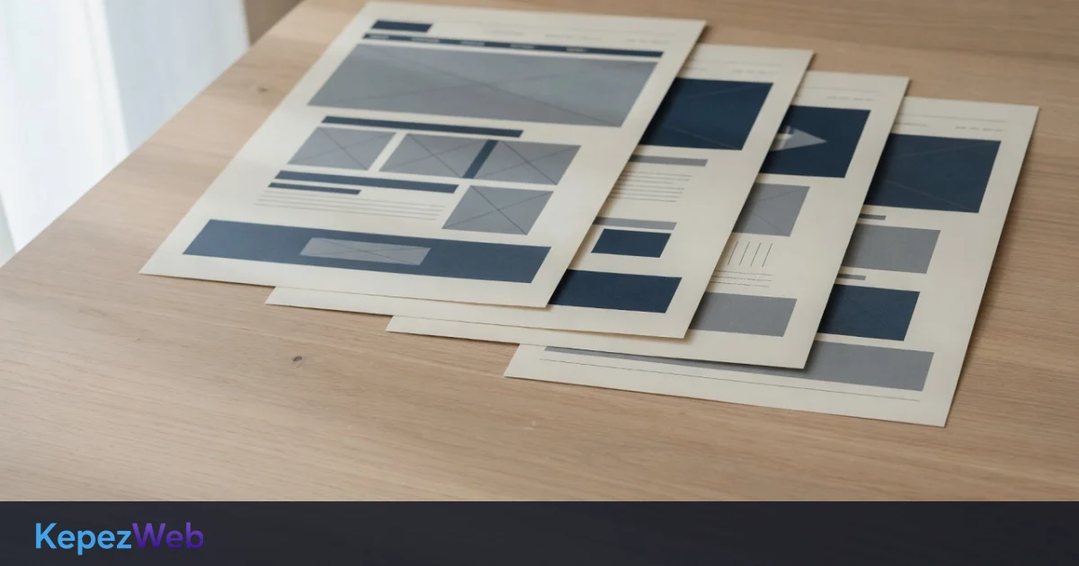
When assessing web design, colours and images often catch the eye first. For a business, however, the real question is how easily visitors can complete their task. Can they find the service they need in the menu? Do they notice the contact link? Can they read the text on a phone without zooming in? These articles treat design not as decoration but as a way of organising information. They offer different perspectives to use when planning a new project or reviewing an existing website.
A restaurant menu page in Antalya needs a different layout from a consultancy’s service page. Photo choices, text length and the order of prompts therefore depend on context. Liking a ready-made layout can be a starting point, but its suitability only becomes clear once the business’s actual content is in place. As you read, list your own pages. Write down one main task for each page and flag any screens trying to do several jobs at once.
These readings cover stages such as preparing a brief, mobile usability, accessibility and handover checks. Rather than sharing only example website addresses when discussing a project, you can describe user needs. Seemingly small details such as headings, link names and form fields belong in that description too. First choose the decision you need to make, then consider the relevant guide alongside your own content. This approach takes design discussions beyond personal taste.
Category reading · Web Design
Read article
Category reading · Web Design
Read article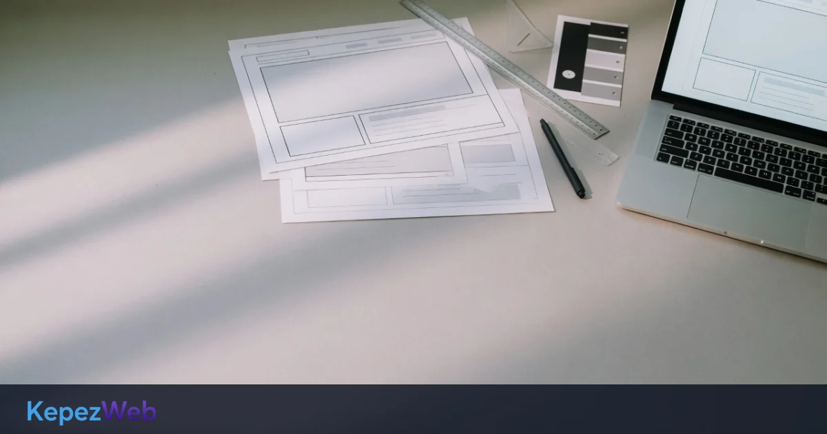
Category reading · Web Design
Read article
Category reading · Web Design
Read article
Category reading · Web Design
Read article
Category reading · Web Design
Read article
Category reading · Web Design
Read article
Category reading · Web Design
Read article
Category reading · Web Design
Read article
Category reading · Web Design
Read article
Category reading · Web Design
Read article
Category reading · Web Design
Read articleLet’s plan a website that fits your business in Antalya, with clear scope and practical next steps.
The AI chat assistant is available in Turkish only.
Replies are generated by AI; do not share personal data. For confirmed information, contact us.