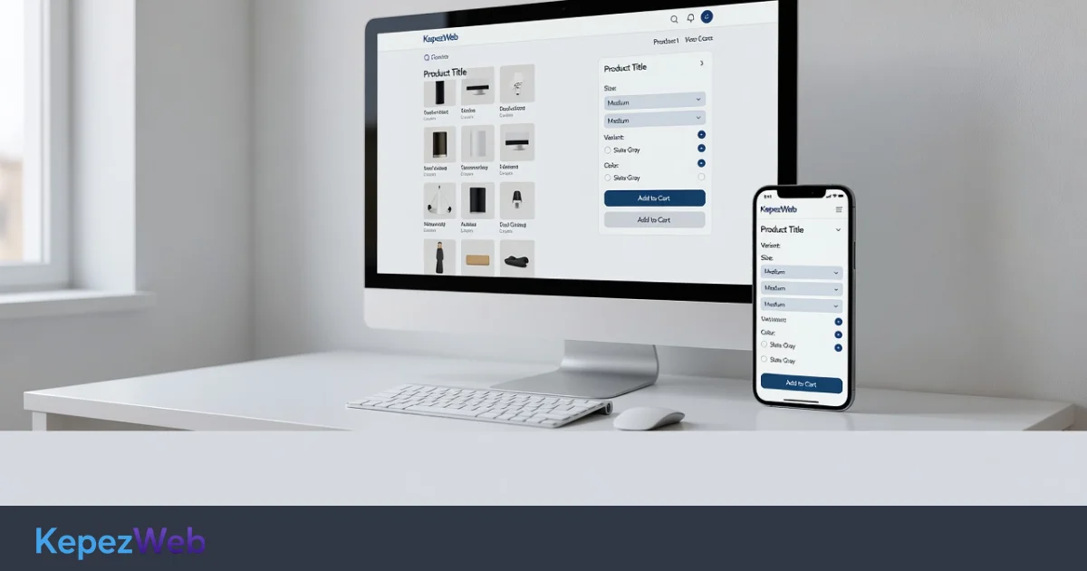
Product page optimization goes beyond photos and prices. This guide explains, step by step, how to improve your page with trust signals, variant selection and a clear call-to-action flow that supports visitors as they decide whether to buy.
E-commerce product page optimization is often discussed purely in terms of image quality, price displays and product descriptions. Yet when visitors land on a page, their real question is: Should I buy this product, from this seller, right now? Improving conversions means making the answer clear, concise and easy to act on.
In this guide, we treat the product page not as a shop-window display, but as a journey through trust, variant selection and calls to action. The goal is not to make the page look fuller, but to create a path that reduces hesitation.
What is e-commerce product page optimization?
Product page optimization covers the changes that help visitors understand a product, choose the right option, assess the risks and add it to their basket. An SEO-friendly title or rich media alone is not enough; the page must support the decision-making process.
A well-structured page does three things at once:
- Quickly explains what the product is, who it is for and what makes it different.
- Makes choices easier: size, colour, package, availability and delivery.
- Makes reassurance and the next step visible through evidence, policies and a clear CTA.
At KepezWeb, we use the same approach when designing product pages: simplify the decision-making journey first, then build the design and content around it.
Understand the three stages of a purchase decision
Visitors do not browse product pages at random. Most follow this sequence, consciously or not:
- Understanding: What exactly does this product do?
- Suitability: Is it right for me, and which size, colour or package should I choose?
- Risk assessment: Are the price, delivery and return terms acceptable, and can I trust the seller?
If any of these stages is weak, the add-to-basket rate drops. Even excellent photos will not keep visitors on the page if sizing is unclear or return information is hidden. Optimization reduces unnecessary mental effort at each stage.
Place trust signals where decisions happen
Trust is not built through an About Us page or logos alone. On a product page, reassurance needs to appear right where the visitor makes a decision.
Which trust signals actually help?
- A clear product title and a simple statement of its main benefit
- Images showing the product in real-life use
- Clearly stated availability, delivery windows and free-delivery thresholds
- Brief, easy-to-understand return and cancellation information near the add-to-basket button
- Verified reviews and Q&A sections
- Payment methods and security information presented without exaggerated claims
Instead of placing all your trust signals at the bottom of the page, put them close to the source of hesitation. A size guide directly below the size selector, a delivery and returns summary beside the price, and stock information near the CTA are more effective placements.
Make variant selection simple and error-free
Options such as colour, size, package and material are among the most error-prone parts of a product page. A poorly designed variant flow leads to stock errors and incorrect orders; a well-designed one quickly answers the question, “Is this right for me?”
Practical rules for variant selection
- Link each option to its images and stock data, and disable selection of sold-out options.
- If shoppers can attempt to add a product to their basket without selecting an option, show a clear warning.
- For products that require size or measurement selection, make the guide available directly beside the selector.
- Update the price, images and stock information immediately when the variant changes.
- Use customer-friendly option labels rather than technical codes, such as “Dark navy”.
Variant structure must also be consistent across the catalogue. Otherwise, stock and SKU mismatches can undermine conversions even when the interface looks right. To keep the wider catalogue consistent, define the product data model at the outset when building an e-commerce website .
Focus the CTA flow on one clear action
When several calls to action compete for attention on a product page, visitors hesitate. In most cases, the primary action is “Add to basket”. Secondary actions such as saving a favourite, asking a question or contacting you on WhatsApp should not overshadow it.
A practical CTA layout checklist
- Keep the primary button text short and action-oriented.
- Keep the CTA accessible while scrolling on mobile, without covering essential information.
- Provide immediate feedback after an item is added to the basket: a confirmation message, mini basket or clear next step.
- If an item is out of stock, offer an alternative, such as a similar product or a back-in-stock notification, rather than leaving shoppers at a dead end.
- Keep the price, selected variant and delivery summary close to the CTA.
Making the CTA bigger is not a solution on its own. If visitors do not know what to choose or what risks they are taking, a large button will not persuade them to click. Reduce uncertainty first, then make the action easy to find.
Use photos, prices and descriptions to support purchase decisions
Images and copy should support decisions, not simply decorate the page. Every image should answer a question, and every block of text should address a hesitation.
- Images: Show the main view, details, dimensions or scale, real-life use and variant differences separately.
- Price display: Do not hide delivery costs, instalment terms or package differences that affect the total cost.
- Description: Turn features into benefits, following this sequence: what it does, who it is for and what to consider.
- Specifications table: Keep measurable details separate and easy to scan for shoppers comparing products.
When writing descriptions, answer the real questions behind a search rather than stuffing in keywords for SEO. This makes the page more useful to both people and search engines. For technical visibility, SEO services should address product data, internal linking and indexing checks together.
Audit friction points with a checklist table
The table below highlights common weaknesses on product pages and straightforward ways to address them:
| Decision stage | Common friction | Suggested improvement |
|---|---|---|
| Understanding | Generic title; images show only one angle | Benefit statement + images of the product in use |
| Suitability | Unclear variants; no measurements | Selection tools + guide + stock synchronisation |
| Risk | Hidden return and delivery information | Brief policy summary near the CTA |
| Action | Several competing buttons | One primary CTA with clear feedback |
| Mobile | Essential information gets lost further down the page | Key information summary and an accessible add-to-basket button |
Do not apply this table blindly to every product type. Shoppers have different concerns when buying fashion, electronics or dietary supplements. First identify the most common reason visitors leave pages in your product category, then prioritise that issue.
The measurement and improvement cycle
Improving product page conversions is not a one-off visual refresh. Guide changes with behavioural data, not assumptions.
- Track add-to-basket rates by product type.
- Identify where visitors leave: the image gallery, variant selector, description or reviews.
- Test one major variable at a time, such as CTA wording, variant layout or trust-section placement.
- Analyse mobile and desktop results separately.
- Standardise successful changes and apply them to similar product templates.
A weak product page can waste your advertising budget when paid visitors fail to convert. Page quality also matters in catalogue advertising and retargeting, so it is more efficient to strengthen the product page journey before scaling channels such as Meta dynamic product ads .
Implementation checklist
Before publishing, run through these checks:
- Can visitors understand the product and its main benefit without scrolling?
- Have you addressed the risk of adding a product to the basket without selecting a variant?
- Are the price, availability, delivery and returns summary close to the CTA?
- Is the primary action clear and easy to use one-handed on mobile?
- Are reviews, Q&A sections and social proof readable and free of exaggerated claims?
- Do page speed or image loading disrupt the decision-making journey?
Most of these checks concern information architecture and interface priorities, not decorative design. Where needed, simplifying the template can deliver improvements faster than editing individual product content.
Frequently Asked Questions
Is product page optimization different from SEO?
Yes. SEO aims to make the page discoverable in searches that match its content and to ensure it can be indexed correctly; conversion optimization helps visitors make a decision and add the product to their basket. The two support each other, but they are not the same task.
Should I improve the images or the CTA first?
First identify where visitors struggle most. If they do not understand the product, prioritise images and descriptions. If they cannot make a selection, focus on variants. If trust is the issue, improve policy information and supporting evidence. The CTA may be the last element that needs refinement.
Should every product use the same template?
A shared structure is useful, but essential fields vary across categories such as fashion, technical products and gifts. Keep the template flexible and provide category-specific sections.
What should I do if there are only a few reviews?
Rather than trying to inflate review numbers, reduce uncertainty with a size guide, a clear returns summary, real-life product images and frequently asked questions. A few high-quality reviews are more reassuring than a section full of fake ones.
What is the most serious conversion mistake on mobile?
Burying essential information far down the page and making the primary action compete with secondary buttons. On mobile, keep key information concise and the add-to-basket journey clear.
Conclusion and Next Steps
If you want to rethink your product pages around trust, variants and calls to action, the KepezWeb Team can help you simplify your existing template. For a roadmap tailored to your needs, visit our Request a Quote page to get in touch.