Accessible web design is not a box to tick after launch. It means making keyboard navigation, focus rings, labels and text alternatives part of your design decisions. This guide uses practical examples to help you integrate all four into your page layouts. The aim is to let visitors complete the same tasks without a mouse.
Accessible web design is not a checklist you open once the colour palette is settled. Keyboard navigation, persistent focus indicators, form labels and text alternatives are design decisions to make as early as your grid, spacing and typography.
This guide treats accessibility not as a patch applied later, but as a set of decisions about focus, labels, alternatives and navigation order. A flow that makes sense with a mouse should let someone using only the Tab key complete the same task.
Why accessible web design is a design responsibility
If an audit report lists issues such as “focus is invisible”, “the menu won't open with a keyboard” and “the icon has no name”, the problem is not just technical: the design has not been fully specified. These details depend on interface layout, component behaviour and content.
Make decisions about these four elements together during design:
- Navigation order: Does the Tab sequence follow the visual hierarchy?
- Focus: Is the active element always visible, without disappearing behind fixed bars?
- Label: Does the visible name of each button, link and field match the name read by assistive technology?
- Alternative: Can the information in an image, icon or chart be expressed in text?
These four elements help people complete the same tasks whether they have a temporary injury or limited motor control, prefer a keyboard or use a screen reader. In a new web design project, postponing them to “quality checks in the final sprint” leaves you with broken focus behaviour and missing text alternatives.
Align keyboard navigation with the visual order
Keyboard users follow the focus indicator rather than simply scanning the page. Focus should move from left to right, from top to bottom, prioritising the path to the main task. If a search box appears on the left but comes last in the Tab sequence, the design and its behaviour are out of sync.
When planning navigation order, treat these rules as design decisions:
- Only interactive elements receive Tab focus: links, buttons, form fields, dropdown menus and tabs.
- Ordinary text, an entire card surface or a decorative box should not receive focus.
- The visual order matches the DOM order. “Fixing” the sequence with positive tabindex values is a temporary patch.
- For pages with large headers, a link that skips the repeated top navigation and goes straight to the main content is one of the first useful improvements.
Making an entire card clickable is a common trap. If the whole card is one large link, Tab stops at each card, and the “view” and “compare” actions inside are not announced separately. A simpler solution is to use the card as a visual container with one clearly defined, focusable link or button. This keeps the sequence short and the name clear.
Custom components, menus and focus traps
An off-the-shelf dropdown menu, date picker or custom select control may work well with a mouse. Keyboard use needs its own interaction logic: Enter or Space opens it, arrow keys move through the options, Escape closes it, and focus returns to the trigger. These are not “micro-animations”; they are the component's interaction rules.
Do not trap focus outside modals and drawers. When a dialog opens, move focus inside it, keep Tab navigation within the dialog, and return focus to the opening control when it closes. If the background page still receives Tab focus, users lose their place. This behaviour also applies to quote forms, cookie panels and language selectors in corporate web design projects.
A sticky header can cover a focused link. Allow padding or a scroll offset equal to the header's height in the design. If focus technically exists but cannot be seen, that control is effectively absent for a keyboard user.
Keep focus rings visible and consistent
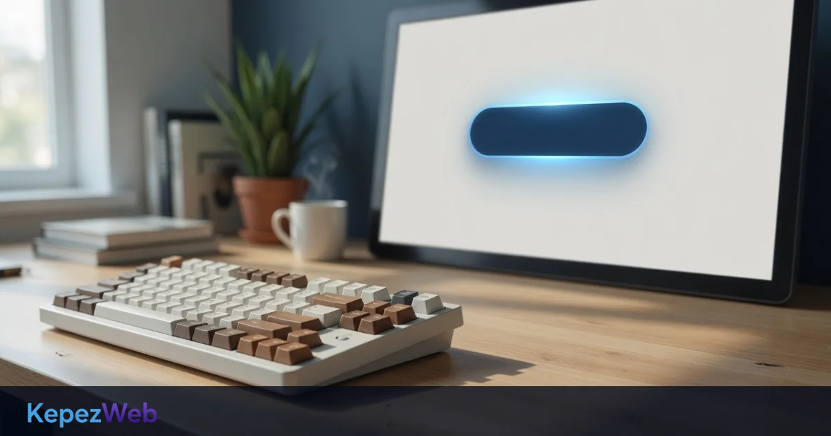
Removing the default focus outline may look “cleaner” for mouse users, but it hides the active element for keyboard users. If you remove it, replace it with a focus ring that is at least as noticeable and fits your brand. A hover colour is not a substitute for focus: hover responds to the mouse, while focus guides keyboard navigation.
The design notes for focus rings can be brief:
- The ring stands out against both light and dark backgrounds.
- Use enough thickness and offset to keep the ring clearly visible.
- Use the same visual treatment throughout the site; a ring on one page and no indicator on another undermines confidence.
- Rounded corners and shadows do not clip the focus indicator.
In KepezWeb projects, focus rings should not be left as a “developer detail”. Buttons, links, tabs, controls inside cards and form fields belong to the same family. The component library defines hover, active and focus states separately; focus is not a faded version of active.
Dark sections, text over images and translucent layers each create risks for focus visibility. A light-coloured hero button may be readable against a dark photo when using a mouse, but keyboard users can lose their place if its focus ring blends into the image. Choose the focus colour specifically for that section's background.
Text alternatives: when to write them and when to leave them empty
A text alternative expresses an image's purpose in words. It does not mean writing a long sentence for every image. Ask yourself: would the page convey the same information without this image?
- Informative image: Products, teams, offices, infographics and charts. The alternative briefly conveys the information in the image. “Image1.jpg” and “product photo” provide no useful information.
- Decorative image: Atmosphere, textures and patterns that fill space. Use an empty text alternative so screen readers skip it.
- Image that repeats text: If the same heading already appears beside it, having the image read out again adds noise.
- Functional icon: A magnifying glass, basket, close icon or share icon. Name the control, not its appearance: “Search”, “Basket”, “Close”.
A complex chart cannot be explained in one sentence. A short alternative identifies the subject; the actual data belongs in a table or a summary directly below it. “Chart showing rising sales” is not enough: include the relevant period and comparisons in the text.
Images inside links create another potential trap. If a logo links to the homepage, its alternative should be the brand name, not “logo”. If a product image is a link, its alternative should not merely repeat the product name; if the link's purpose is to open product details, communicate that through visible text or an accessible name. The same principle is useful during a technical SEO audit : empty or repetitive alternatives make images less useful to people using assistive technology and obscure their context.
Icon buttons and image-only calls to action
An icon without text may seem “obvious” when using a mouse. Without a name, however, the control is silent to a screen reader and unclear to keyboard users. Heart, three-dot, arrow and close icons need either short accompanying text or a consistent accessible name. The name must not contradict the visible label: a button displaying “Send” should not be announced as “Submit form”.
Background images added through CSS have no alt attribute. If information is embedded in such an image, put it into HTML text. A campaign date, price or warning that appears only in an image is unavailable to anyone who cannot see it. Keep changing details such as prices and time limits in the text layer rather than embedding them in images.
Labels, accessible names and skip links
The visible label is the source of the accessible name. Placeholder text is not a substitute for a label. A “Your name” placeholder disappears when the field is filled in, so users cannot see what you asked for when an error occurs. Keep the label outside the field, associate it programmatically with the field, and make the error message identify the field concerned.
ARIA attributes do not replace semantic HTML. A button should be a button, and a link should be a link. Retrofitting keyboard support and an accessible name onto a clickable div costs more than choosing the right element from the outset. Use ARIA to fill genuine gaps in custom components.
The skip link (“Skip to content”) is the first focusable element and becomes visible when focused. A skip link that stays hidden even on focus is effectively useless. On long corporate pages, this small control saves users from navigating the entire menu every time.
Page language, heading hierarchy and landmarks also support navigation. A flat list of h2 headings or three “main content” regions disrupts both keyboard navigation and the screen reader's heading list. A heading is a structural marker, not a font size: large text may not be a heading element, while a small label may be a genuine heading.
What to check during design
The comparison below shows which decisions to make during design rather than patching them later.
| Decision | Built into the design | Patched later |
|---|---|---|
| Navigation order | Plan the visual hierarchy and DOM order together | Force the sequence with tabindex and hidden focus targets |
| Focus ring | Distinct from hover and visible across all components | Remove the outline, then restore it on just one page |
| Text alternative | Specify the image's purpose: information, decoration or control | Paste in a filename or an uninformative “image” label |
| Label and name | Match the visible text to the accessible name | Leave only a placeholder or an icon |
| Dialogs and menus | Define opening, closing and focus-return behaviour | Close with a mouse, but leave Escape and Tab unsupported |
Test by unplugging the mouse. Complete the main task using only the keyboard: navigate from the menu to a service, submit a form, open the main link in a card, and close a modal. If focus disappears, the sequence jumps backwards or a control has no announced name, what is missing is not an “accessibility plugin” but a clear set of design rules for that component.
Every task that can be completed with a mouse should also be possible with a keyboard, following the same sequence and using the same names.
Frequently Asked Questions
Is accessibility only for users with permanent disabilities?
No. A broken arm, bright sunlight, a faulty mouse or simply a preference for keyboard use exposes the same gaps. Addressing those gaps in the design means tasks are not tied to a single input method.
Does removing the focus outline harm the brand experience?
Removing it without a replacement does; a consistent, on-brand focus ring does not. Using the hover style as a focus indicator is not enough. Check the ring separately on dark and light backgrounds.
Does every image need alt text?
No. Informative images need short, accurate alternatives. Decorative images should have empty alternatives. An icon button needs the control's name, not a description of the image.
Does using ARIA make a page accessible?
Not on its own. The right HTML elements, visible labels, keyboard order and visible focus do the essential work. ARIA fills remaining gaps in custom components; incorrect ARIA can be more confusing than an unnamed control.
When should you test this?
When the component is first designed. Do a keyboard walkthrough before approving menu, form, modal and card templates. A single check before launch cannot cheaply resolve focus and label decisions that should have been made earlier.
If you want to plan keyboard order, focus rings and text alternatives from the outset for a new website or redesign, discuss the scope with the KepezWeb team. To request a quote tailored to your needs, simply leave a short note.